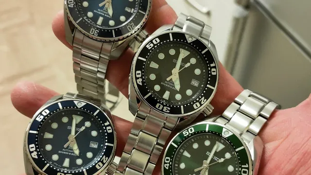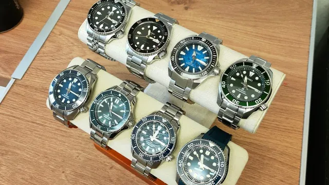
Gen 3 Sumo: they fixed the font, chopped the lume triangle, and I still love him
They changed a few things
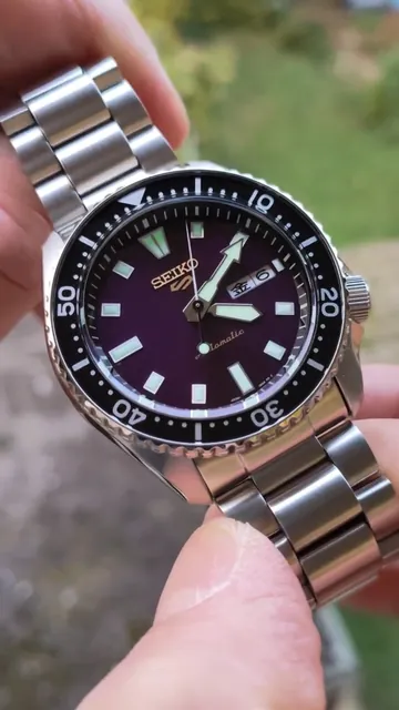
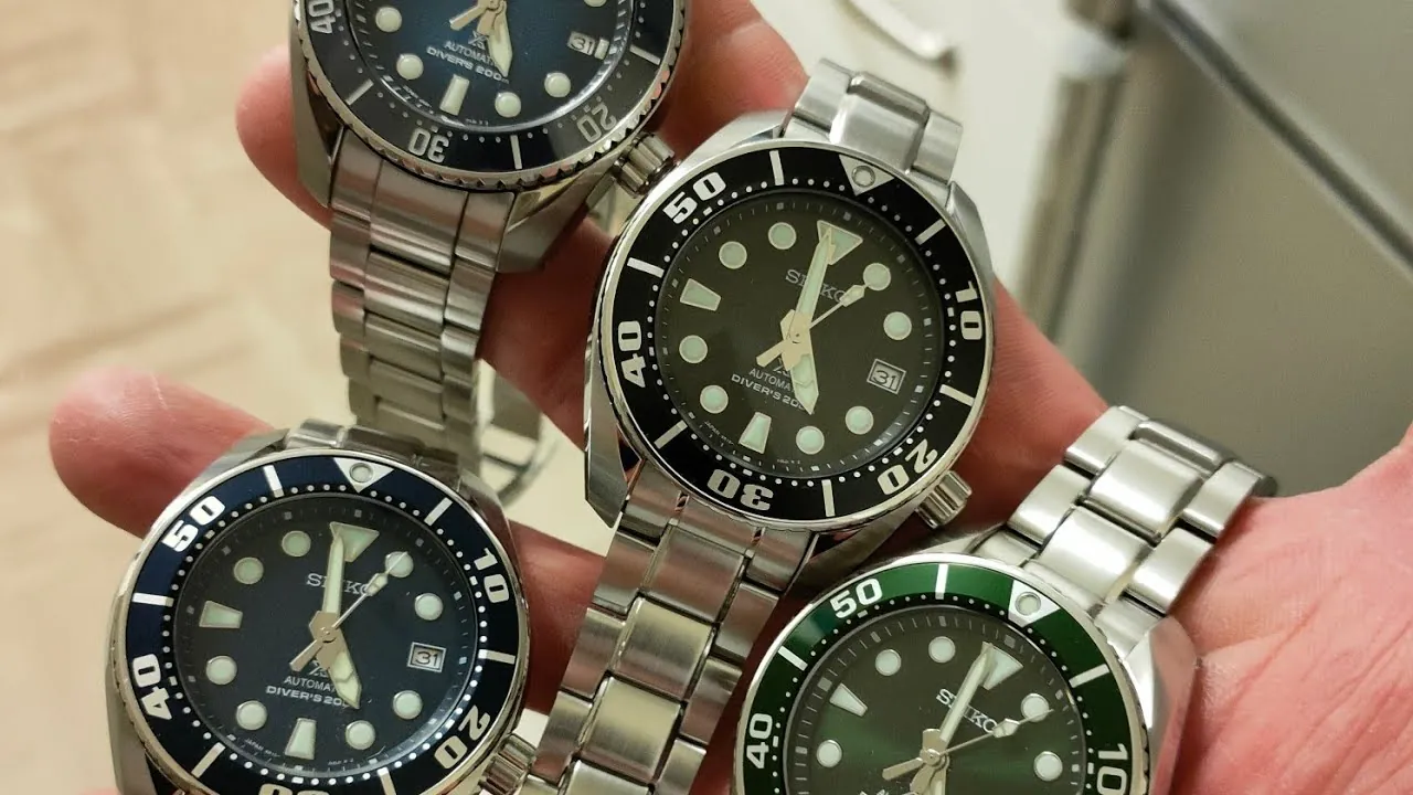
This is where it starts to change in the world of the Sumo. New bezel font, and I don't like that they got rid of the goofy font. They replaced it with a much more sensible looking one. And look at the loom triangle at 12. They chopped the bottom off it. Why did they do that? You looked brilliant.
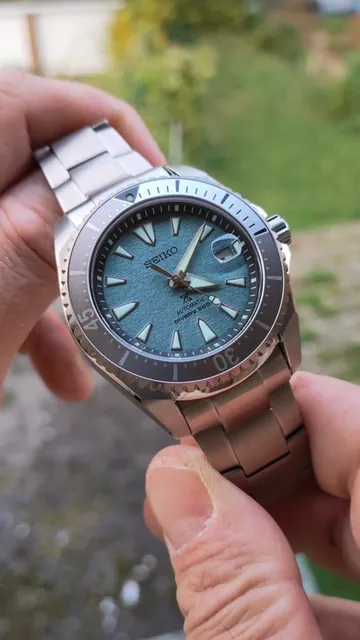
Different chapter ring, different 12 o'clock marker, and the handset has been slimmed down. You've lost the horizontal strike and been granted a vertical strike. I don't know. I just like the old one.
Flat sapphire, goofy lugs
Aluminium bezel insert is still here, but now you get a sapphire crystal, which has become flat. It used to be domed, and I like the dome. Still a big twerp, a long twerp, with a funny buck-toothed little lug arrangement and 20 mm lugs. But isn't it just great? I love this. And there's a sad downgrade alongside all the upgrades: something's missing that they forgot to put on there.
Verdict
The Gen 3 is still an exceptional time warrior, only for the beefiest of beef stones. Look at that. Unreal.